Tuesday, February 20, 2018

Cardboard Kindness

I have a couple mail days from bloggers that I need to post.  One that's old and sorely needs a post.  The other is a fresh package.

Let's start with a package from Nachos Grande as part of his "Season of Giving."  He sent over a flat rate box full of Mariners cards.  There were so many cards, many of which I have never seen.  I'll highlight a few of my favorites.

1999 UD Choice

It's always nice to add more Griffey cards to the collection.  I haven't heard of Choice before but I'm guessing it's an offspring of Collector's Choice.  

1997 Collector's Choice

Normally I'd be loathe to highlight a card with Alex Rodriguez.   Although given my recent Padres fandom I'm happy to see Tony Gwynn.  I like this League Leaders card as it features the AL and NL player side-by-side.  Back before interleague play it always seemed like such a big deal to see AL and NL players together.

2003 Fleer Box Score

Another new set for me.  This set features a notable box score on the back for each player.  Edgar's box score was from the 1990 season when he had a two home run game.  From a historical perspective this could be a fun set to put together.


I don't understand this card.  The Mariners are listed as the team.  Yet, Johnson is pictured in an Astros uniform.  He was traded to the Astros *after* playing for the Mariners so why wouldn't Upper Deck list the Astros as the team if they are going to feature him in an Astros uniform?  

2012 Bowman
For whatever reason, I've enjoyed putting together the base Bowman set more than I have Flagship.  Maybe it's because prospects are sprinkled into the insert sets.  Plus, the colored parallels have looked a lot better than the Flagship design the past couple years.


1994 Bowman's Best

I'm highlighting this card just for the fact of seeing Johnny Damon as a skinny, clean faced kid in a Royals uniform.  That's not the image I have of him in my mind.  He just looks so funny.

Thank you again Nachos Grande!

----

Next up is a recent trade package from P-town Tom of Waiting 'til Next Year...


Here are the cards I was expecting too get, 2013 Panini USA Champions. This puts me under 10 left on the base set. I opened up a box last year chasing a Kris Bryant auto on the cheap (no such luck) and ended about a dozen cards short of the set.  I can't leave a set unfinished when I am so close. 

Tom, being the stand up guy that he is, also sent along quite a few more cards. Thanks Tom! He said that he didnt know how the junk wax cards slipped into the package but as you'll see there was certainly some non junker cards!

2017 Panini Chronicles

A purple rookie parallel of Guillermo Heredia from the weirdly overpriced Chronicles. A blaster box contained a whopping 20 cards. I feel like Panini is always providing terrible value in their retail products. I don't care about hits but give me more cards damnit! These are not $1 cards.
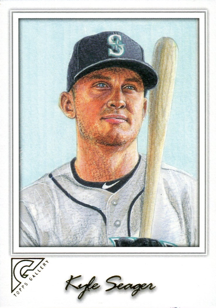
2017 Topps Gallery

I looked down upon Gallery as I thought a lot of the drawings were bad. This Seager card looks alright though. I only wish the cards were printed on canvas stock. That would have piqued my interest a little more.

2016 Topps High Tek

If Mitch Haniger had not had his face busted open last season requiring plastic surgery, he could have been the Mariners' best player behind Cruz. Given the Mariners injury luck he will probably go down to an injury at some point this season.

I believe this is my first look at High Tek in hand.  These cards are kinda neat with the crazy background and translucent card stock.  I'll have to keep my eye out for more.  

2015 Bowman's Best

This card is thick.  Unnecessarily thick.  It's 138 pt.  There is probably some backstory here I don't understand.

1970 Topps
Vintage! Wow! It's of the short lived Seattle Pilots.  I did not previously have any cards from 1970 Topps so this is an excellent addition.

Thank you again Tom! I am blown away by your generosity.  And believe it not I even appreciate the junk wax you sent along. 

That wraps this post for today.  A lot of cards to sort through that will keep me busy!  Thanks for tuning in.

Wednesday, February 7, 2018

Feeling A Wave of Excitement with A 2018 Topps Jumbo Box

After all but ignoring 2017 Topps, I was completely on board with 2018 Topps.  Admittedly, the design won't .  However, it is serviceable and after my dislike towards last year perhaps I was just eager to like a Topps design again.  I knew I wanted to hand collate this set so that meant buying a hobby box.

I bought a jumbo box for several reasons.  First, I know if I bought I hobby box I would end up with a standard relic.  At least with a jumbo box I get an autograph and manufactured relic in addition.  Second, buying a jumbo box usually guarantees pulling one full set.  I didn't want to buy a hobby box to then have to chase down the rest of the base set.  Finally, getting two silver packs instead of one was an extra incentive to spring for the jumbo.


I'm starting with the silver packs as they were the first things I opened.  Here are the highlights from the two packs I opened.  They are all base, with a nice Devers rookie.  It's hard to feel disappointed with getting only base as these are essentially free cards.

I'm not familiar with the 1983 Topps design but these have a nice modern look.  I hope it's something continues to do for Flagship each year.


Here is a small sampling of the vertical and horizontal base cards.  The design won't win any awards but it is miles ahead of last year's design that felt sloppy.  Though, I could do without the disintegrating name and team plates.

The photos have some nice variety as well.  The picture quality is crisp and bright.  Last year everything looked dull.  I do miss borders but the full-bleed photos are nice.  The design doesn't get in the way of the photos like 2016 and 2017 Topps designs.

I think I can tolerate staring at this design for a whole year.


I have a couple problems with the backs.  Why is there a black box around the social media handles? Why are the social media handles the biggest thing on the back of the cards?  They are weirdly emphasized over everything else.  Get rid of them or make them smaller.  Preferably delete them.

The write-ups should be centered or justified.  Otherwise there is this weird blank space on the right.

Lastly, I still cannot support the elimination of full stats.  I will never be okay with this.  Thankfully they are not going the Panini route and eliminating all but one year of stats.  Topps has shown some restraint.


Parallels are underwhelming without borders.  They are also easy to miss.  Here's a side by side of a gold with the base.  They don't pop like they should.

Rainbow Foil / Black

The rainbow foil parallels are always easy to spot.  The black parallel took me a few seconds of studying to realize it was a parallel.  I hate to say it but the Yankee uniform looks rather nice against the black background.  I always enjoy it when a color parallel compliments the photo on the card.


I don't know if this was the case last year but for inserts Topps has forsaken breadth for depth.  I pulled a grand total of four different inserts.  If you like putting together insert sets, the checklist depth for them will make it very difficult to put together without spending a lot of time trading or shelling out money. 

The non-chrome 1983 cards still look fantastic.  If the insert set wasn't ONE HUNDRED FREAKING CARDS, I could see myself consider putting it together.  Since it is so big, I'll collect whatever Mariners/Padres are in the set and call it good.


Topps Salute
Topps Salute is back again as a mishmash insert.  Here is an idea to improve Topps Salute.  Remove all rookies.  Remove all legends.  Keep only the special jerseys.


The promised manufactured relic of the box.  The Spring Training logos have looked cool the past couple years and this year is no exception.  I'm curious to hear what happens with MLB's investigation into Sano's alleged sexual assault.  This is already shaping up to be a poor choice of a card.  


The second promised relic of the box.  I have a feeling that the jersey piece isn't from an Astros jersey but a Tigers jersey.  I bet Topps had some left Tiger jerseys of Verlander after he was traded.  Either way, he's a World Series winner so it's a nice hit.

I like the base relic design, unlike last year's that looked like it was designed at the last second.  It's a basic design but I think it looks nice.  I'm happy with the hit.  


Lastly, we have the 1 promised autograph.  Verdugo ranked as the 33th best prospect.  He's only 21 and already made an appearance in the MLB.  In 21 at bats he had only four hits but that's a small sample size.  In AAA he hit .314 with a .389 OBP.  He probably won't make the 25-man team coming out of Spring Training but is waiting in the wings should the Dodgers need some help.

The autograph is on-card so that's a plus.  The 1983 design makes for a great autograph.  It's a base auto but much like the relic, the card looks great so I'm not complaining.  


The last "hit" of the box was this Kershaw short print.  Short prints aren't as plentiful like they were in 2017 Update.  That makes this is a nice pull, especially of such a quality player.

Overall, I had a great time with this break.  The silver packs added a lot of value and look to be back for Series 2.  That means I'll be back for Series 2 as well.