Old habits die hard. Basketball was my favorite sport growing up yet I have only faint interest in the sport now. Even so, I want to follow the sport and continue my basketball collection. Due to the dark cloud the NBA left over the city of Seattle when the Sonics left, I can't in good conscience become an NBA fan.
I try to resist the urge but sometimes I falter. I'll allow myself the sporadic retail packs and nothing more.
My Fred Meyer had a lone box of 2016-17 Panini Prestige so I had buy two packs to see how the design looks.
Here is a breakdown of my two packs, with six cards per pack:
Pack #1


Only two names I recognize here: Draymond Green and Marc Gasol. Like I said, I don't really follow the sport.
I like the base card design for its simplicity and full-framed photo. The rookie card of Beasley has the design elements switched so I wonder if that's consistent between all the rookie cards.
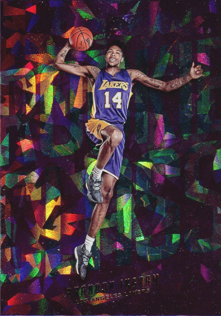 |
| Rookie Class - Crystal Parallel |
Pack #2

Only four base cards in my second pack, with two rookies. I like that kind of collation. I was also right about the design being switched for rookies and veterans. I recognize Jrue Holiday and Arron Afflalo from their days of playing with UCLA in the then PAC-10.

Your look at the back of the base cards. Standard Panini fare with the repeating image and single year stats. I like how Panini at least color shaded the back image.

C'mon Panini, you couldn't feature Ewing during his time as Supersonic? I kid, Ewing was on his last legs when he played in Seattle. Although if I were to ever create an all-time Sonics binder, he would absolutely be in there.

I think this is the Acetate insert. The card between the top and bottom banners is actually clear, with the exception of the Knicks logo and Porzingis. The crowd in the background is also translucent. It's a neat looking card and it might actually be my first acetate card.
For retail packs, I'm impressed that there was a pack for two insert cards. I expected only one. The base design is okay but the inserts were the attraction for me. I might consider buying another pack or two hoping for another interesting insert.
That usually seems to be the case for Prestige. The design is usually clean and basic, but definitely not ugly. Inserts rule the day in this product, though, as they are usually pretty well-designed and fall into packs with frequency. Nice looking cards.
ReplyDeleteNow that you mention it, this design of Prestige is similar to the design of the football Prestige in the sense that it is clean and basic.
DeleteFirst time I've seen any actual break of this set. I really like it. If Panini could bother to make a set larger than 200 cards this would be a major favorite of mine.
ReplyDeleteThe small set size is really too bad. You'd think Panini would want a bigger set because a bigger checklist = more cards to chase = more packs to buy.
Delete